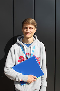
This is the edited version of the cover image, I used Photoshop to edit the image. I removed all of the white marks from the background, I used the Burn Tool, Spot Healing Brush, Blur Tool and Pencil to remove all of the marks. I then removed imperfection from the model, for example moles, spots and reflecting hairs. I removed theses imperfections with the Spot Healing Tool. I also removed the triangle shaped gap from the shadow with the Spot Healing Tool. I then used the Spot Healing Tool to remove a white mark from the folder that the model is holding.
Thursday, 24 September 2015
Cover Image Choice
I decided to choose this photograph as the cover picture because I liked the background as it was not distracting and also seemed professional. There are some imperfections in the picture but I decided that the picture was still the best and that I would be able to fix the problems with Photoshop. I gave the model a folder to make him seem more like a student and not just a regular person, I believe that it is a stereotype that students carry folders but I included it anyway as it does work well to make a clear point that the model is a student. I also made sure that the model's college lanyard was clear because to make sure that people definitely are aware that he is a student.
Labels:
College Magazine;
Possible Cover Photos
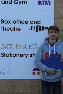
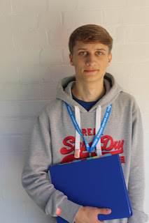
This is a collection of photographs I took, each of these photographs has a possibility to be one of my cover photos. Some of the photographs are not as good as the others because of shade, sun or positioning. I originally had the model standing at the left but changed to the right because i decided i would prefer my cover lines to be on the left side of the magazine cover.
Labels:
College Magazine;
Wednesday, 23 September 2015
Thursday, 17 September 2015
Thursday, 10 September 2015
Test Post
I like this cover because it clearly shows that Denzel Washington is the criminal and Russell Crowe is the police officer by using red text and blue text. It also uses Red, White and Blue which emphasises the word 'American' as they are the colours of the flag of the United States of America. It says that it is "The Crime Issue" which suggests that it is a special issue. the magazine includes posters which would attract some people. I like the dark colour scheme as it fits with the violence and darkness of gangsters. The use of colours is very good on this cover.
Subscribe to:
Comments (Atom)


